

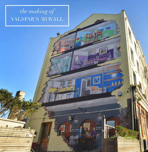
 Ever since I announced my role as Valspar Paint’s brand and colour ambassador, I’ve been itching to share the next part of our work together – a huge 3D house wall in central London. Valspar commissioned me to design the interior and colour schemes for each room in a fictional family home, that would then be used to create a life-like 3D artwork on the side of a huge building in London. So late last autumn I set about working on moodboards for each space in the house, and it was such a fun project.
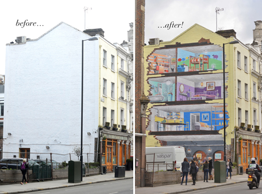 My aim was to try and inspire creative ideas to ‘colour outside the lines’ with paint: I was keen to show how paint can be used to make stylish colour statements outside of the standard feature wall. I teased the wall on Bright.Bazaar’s Instagram last week, but today I wanted to share my moodboards and design tips from the different rooms and schemes. First, take a peek at the transformation of the wall from blank and boring, to bright and beautiful!
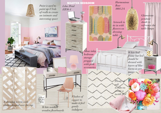 This was my moodboard for the master bedroom, where I was keen to show how colour and paint can create a stylish tonal scheme. A tonal scheme is perfect for a bedroom because by combining shades of one colour in a room you make the space visually ‘easy’ on the eye. This means there aren’t contrasting colours fighting to be the focal point, so the space feels calm and serene. I also used this space to demonstrate how painting up 2/3rds of your walls can help to make a bedroom feel more intimate. This approach encourages the eye to be be drawn down towards the bed, making the space feel cosier. For the wall I ended up swapping out the lighter pinks for a more indulgent purple base palette, which also works well as purple is an introvertive colour that encourages deep contemplation and meditation.
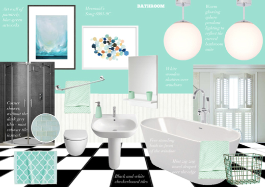 The bathroom scheme was inspired by the pastel houses of Notting Hill in London, so I embraced the ever popular zest for mint in the home. A minty, blue-green hue is ideal because it marries the natural harmony of green with the tranquillity of blue. This creates a serene vibe that’s perfect for a relaxing bathroom. I added visual interest with art prints and graphic, patterned towels.
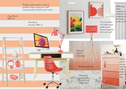 Stripes come a very close second on my ‘decorating elements I love’ list, so I knew I was keen to include them one of the room schemes from the start. I decided to introduce them as painted horizontal stripes in the office in order to elongate the small space. I then introduced the ombre chest of drawers to echo the stripes and warm golden sunsets. When decorating with painted stripes, you can utilise the pattern to maximise the visual appearance of space. If you have low ceilings, vertical stripes will make the space seem loftier, while horizontal stripes will elongate a narrow room. As stripes are a strong, graphic pattern choice, I kept the rest of the space relatively pared-back to allow the painted stripes to shine and not conflict with other elements of the room.
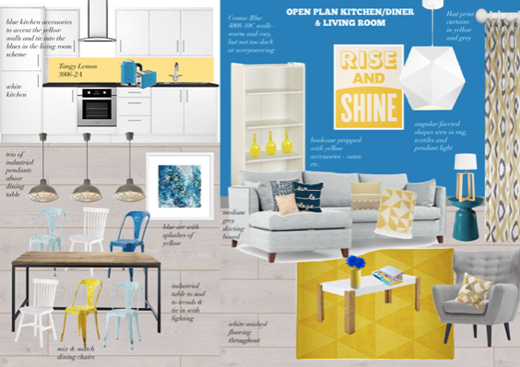 In modern open-plan spaces colour can be used as a decorating tool to visually zone the space. Yellow is opposite blue on the colour wheel, so it creates a fresh and energising complimentary colour scheme that’s ideal for a family kitchen/living space. In fact, yellow and blue is my all time favourite colour combination because it offers the perfect balance of energy and calm. This duo of hues also reminds me of sunshine and blue skies, sand and sea and so on – all great things! Don’t feel restricted to place furniture only against walls – make the most of all the real estate on offer. You can stop items appearing to ‘float’ in the middle of the room by using other decorating elements to anchor them. For example, a trip of pendants above a dining table will anchor the table and create a welcoming eating area within the space. Also, when using two colours to zone an open-plan space you can layer the second hue into the main living area as an accent colour – which is typically 10% of the total scheme – into the room to create a cohesive final look.
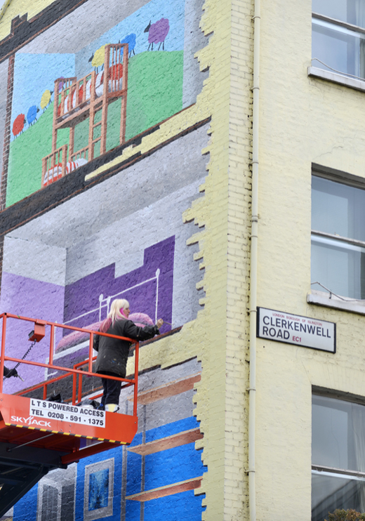 It was fascinating to watch the two artists working with the paint to bring my moodboards to life – I was blown away by how true to life they made each scheme look. I went up on the lift a few times and it was HIGH up there – yikes!
 It was a very surreal moment when I saw a painted version of myself on the wall wearing the outfit from the Valspar TV advert. I figured, if there was ever a selfie opportunity, this was it! I’d love to know what you think of the 3D wall? Have you seen it in person? It’s funny seeing the reactions of passers by and those riding the bus as it pulls around the corner!
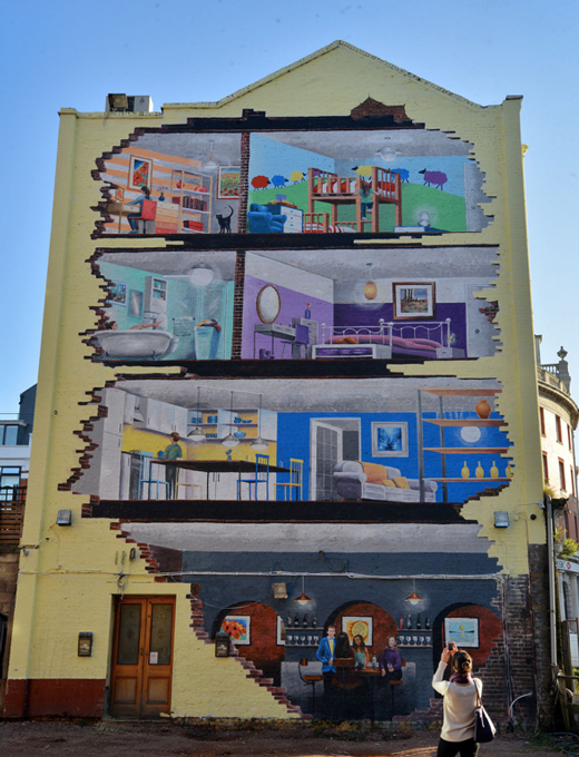
// Photography by Valspar (used with permission)
32 Comments
Amazing! you can design anything Will and thanks for the tips when coloring a room 🙂
@Mary Beth – My pleasure! Thanks for the kind comment!
You are such an inspiration, Will! Thanks for sharing your tips, I love the one about painting up two thirds of the wall.
@Susan – Thank you for such a lovely comment! Isn’t that painting idea fun? I want to try it for myself one day soon!
How fantastic is this!!! Congrats!
@Jee – Thank you so much! 🙂
Love the wall mural! I particularly like how the artist has painted the broken bricks, revealing the interiors. So clever!!
I bet it looks amazing when you’re up close 🙂
Emma Jayne x
@Emma – Thank you! I love that detail as well! 🙂
LOVE the yellow + blue room’s space + set up, and of course this whole campaign! Great work as always Will.
Best,
Josh – The Kentucky Gent
http://thekentuckygent.com
@TKG – That’s my favourite space and scheme, too – great choice! 😉
I spotted you on the Valspar ads and I love you mood boards!
I’m not a fan of turquoise in the bathroom, it’s a lovely colour and I had a bathroom in the same colour, but it can make the skin look rather sallow, I know!
@Alison – Thank you! I agree, that’s why mint works well because it’s subtler than a classic turquoise!
You are so talented, it’s unreal!~ Great job
@Colsie – Thank you so much! 🙂
So cool!
@Leslie-Anne – Cheers!
Congratulations, it looks amazing!! What a fantastic advertising idea!
@Trude – Thanks! 🙂
Such a cool project, well done Will. Pretty big job!
@Mat – Thanks pal!
I renovated one flat close to clerkenwell and used to be another picture but this one is great!!!!!
@Laurentino – So pleased you like it! 🙂
Congrats, Will!! Its sa fantastic idea!
xo,
@Mel – Thank you! It was a great project to work on!
Wow, that’s incredible! Love it!
@Josh – Cheers! I am very proud of it!
Wow! That is amazing!
@Allister – Thank you!
That is SO cool…looks like it’s a great addition to the neighborhood!
@Melissa – Thank you! It’s great watching the reactions of people as they walk by and spot it for the first time!
The change is unreal. You’re talented. And visionary. Congratulations for the work! It will become a tourist attraction. You don’t see such works every day and on every building.
@Monica – Thank you so much for such a lovely comment! I am very proud of the wall, so it means a lot to read this! 🙂