
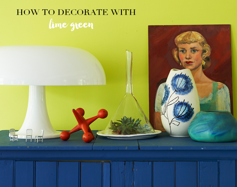
 Diving in at the deep end with super bright hues such as lime green can seem intimidating, so I hope this post is useful for raising those colour confidence levels! Embracing lime green can pay incredible design dividends, as the wonderful home of Raina Kattleson from the first Bright.Bazaar book shows. The key to success with a lime green-focused colour palette is to take one of two routes: you can lavish key pieces with colour such as walls and floors and keep furniture and accessories neutral. Or, switch it up and use layers of lime and turquoise shades to add interest to a more neutral space.
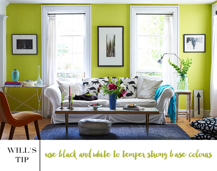 Raina’s open plan living space demonstrates how to get the right balance when it comes to painted lime green walls. The smooth lime green base throughout serves as the perfect backdrop to layer in small splashes of blue hues throughout the space. By letting the lime green hue take the lead in the scheme, it allows accent hues to be used as a tool to break up the strength of the dominant hue. There’s a fresh, healthy and energizing feel to this palette; I like how the lime brings a zesty kick that’s tempered by the azure blue hues. Remember that it can work to bring two strong colours together as their joint intensity can serves to bring balance to a palette, just like the lime green and turquoise blues here.
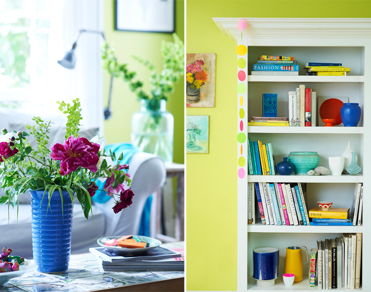 Treat side tables and bookcases like mini stages to display accessories that coordinate with the colour scheme of the room. This turquoise vase perfectly offsets the lime green walls of the living room, while the flowers help to visually soften the look of the room.
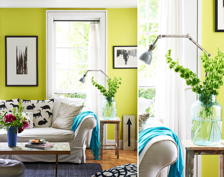 Colour is a great decorating element to help zone an open plan space because it provides a visual indicator to the change of purpose in the various parts of the room. The continuation of lime green across the walls here helps to tie all the sections together and offers a synergy between each area. Meanwhile the array of blues that are layered into the space to signify the zones: an ultramarine painted cabinet and tiled fireplace draw the eye along the feature wall of the room, making statements out of both in the process. The change in pace to a steel-blue denim colour for the rug and radiator pulls the far end of the space together, grouping the living room furniture. Surprise orange accents complete the scheme by inviting visual interest and echoing the clean finish of the lime walls.
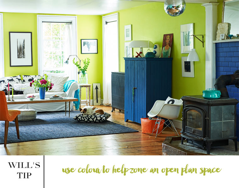 The floor-to-ceiling lime walls in Raina’s upstate New York living room brings punch to the flea market finds and weathered furniture layered throughout the scheme. Notice how the vivid turquoise throw draped on the sofa creates depth and interest – it really helps to soften the scheme and tone down the punch of the green. I hope you found this colour advice useful! If you would like to buy the book, you can do so in the following places: Amazon UK / Amazon USA
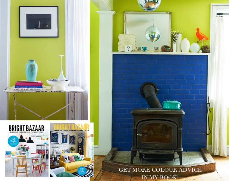
// Photography by Andrew Boyd for the Bright.Bazaar book


19 Comments
Lime is definitely quite the statement color, but I’ll admit it looks great on the walls. Especially with those neutral colors to ground everything out.
Josh – The Kentucky Gent
http://thekentuckygent.com
@Josh – I agree. The black and white to touches work wonders here.
Thanks for sharing these tips with us Will. Can’t believe I don’t have a copy of your book yet so going to order now!!!
@Gina – My pleasure. Thanks for ordering the book, I hope you enjoy it!
I wouldn’t have thought to do this but it really works!
@Jules – Right? Just shows how great such a palette can be.
I remember this lovely home in your book and thought how very brave they are. It’s a tough colour to work with but they pulled it off well. Mel x
@Mel – I agree! Raina is incredibly talented and her space shows how to get this palette just right. x
love that first image with the lime green and blue. it’s not a colour I have used I have to say but that image makes it extremely tempting.
ps i was at college the other day (mature student one day a week finishing off my interior design….) and you will be pleased to know everyone was buzzing about valspar and their ambassador! you’ve done a great job 🙂
@Fiona – Isn’t it great when you can see two colours together in a new way for the first time? I love it – such a thrill! Great to hear everyone is as excited about Valspar as I am, too! Thanks for the kind words. 🙂
Great post. I am planning to repaint my living room in lime green later this year – so very inspirational. Thank you.
@Natalie – So pleased you found it inspiring! I adored Raina’s home and her unique use of colour!
Oh yes! love the dark blue against the lime green!:) very pleasing!
@Ella – Me toooooo!
The black frames of the pictures and the white of the window frames help calm the friskiness of the lime and the blues seem to scream ‘Hey Limey, I’m here too!” Love it 🙂
@Anna – Yes, that’s so true! 🙂
I love this colour combo. So bold, cheery, full of personality. It’s a shame that not many people are brave enough to use these happy colours!
@Karolina – I agree, it’s such a wonderful colour!
Love the boldness of this space, the zingy lime green works so well against the cool tones of denim blue, plus the monochrome accessories really help balance out what could be an overpowering colour. The pops of bright orange are a great fun highlight too, and who couldn’t live without a mirror ball! 🙂