

 Whenever I eat somewhere I often care just as much about the interior as I do the food I am eating. In my book, no matter how good the food it just isn’t enjoyable to eat if consumed in a poorly lit or designed interior. You know when there’s a bright white strip light shining in your face and it feels more like you are at the dentist than out to dinner? Yeah, that’s 100% one of my pet hates! So when I heard about 400 RABBITS in London’s Crystal Palace I was excited to see inside because I had heard rumours of it’s colourful aesthetic knocking it outta’ the design park. Those rumours weren’t wrong, so click through after the jump to tour the whole restaurant with me!
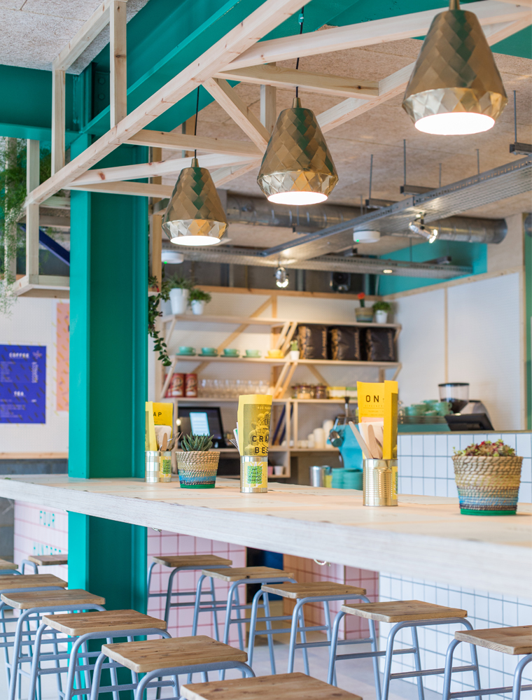
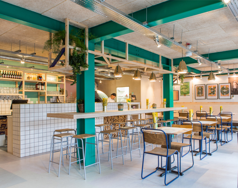 The restaurant’s design was a collaboration between Richardson Studio, who designed the interior, and Junction who developed the branding. I was interested to hear how the team were bored of seeing the somewhat ubiquitous caged light bulbs, exposed brick and rusty metal design themes. Staying away form this look, the design team wanted to reflect the unique inspiration behind the restaurant: The name ‘400 Rabbits’ is inspired by Aztec folklore. Essentially, two fermentation loving gods ‘got it on’ one night and spawned a bunch of offspring known as the Centzon Totochtin AKA 400 Rabbit Gods. These rabbit gods liked to party, drink and generally get into mischief. So 400 RABBITS is a celebration of two of the best things those fermentation gods ever gave us – sourdough pizza and beer.
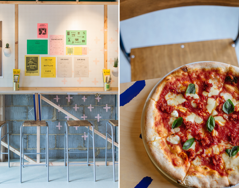 Stylistically, Italian, British and Aztec was too much to take in, so the designers decided to focus on the mood. Their main aim was that the interior had to feel playful and fun. Sounds very #MakeYouSmileStyle to me! They decided to reflect the beautifully simple approach to pizza via a design that was equally as fresh as the ingredients and not remotely traditional. Skewing the Italian aesthetic by warping the classic red and green, into pink and jade the colour palette feels at once striking and subtly Italian.
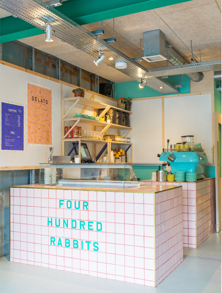 The joinery and details were kept simple using standard timbers and pegboard to create a layered back-drop to the colours and artwork – which became the focal features of the space. I like how they plan for these artworks to grow and evolve over time; it’s a lovely way to reflect the start-up nature of the brand. In fact, the design team designed the wall graphics to create the sort of atmosphere that might come about if you filled the room with 400 drunk rabbits! This is a space fizzing with a lot of fun, splashes of colour and a set of eye-catching graphics.
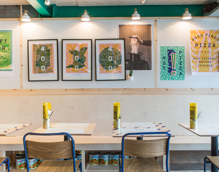 What’s catching you eye from the interior of the 400 RABBITS restaurant in London?
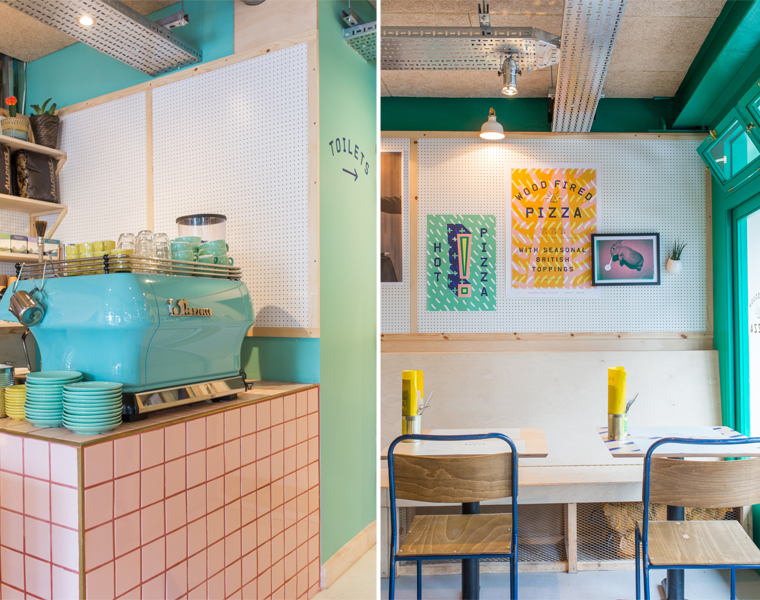 // Photography courtesy of 400 Rabbits and used with permission
20 Comments
Whoa! This restaurant is so so lovely! I love all of the colors on the wall most of all.
g.
@Gabriella – The colour palette is so lovely, isn’t it! Love the jade green.
Stunning space! Thanks for sharing it with us Will!!
@Susan – Right?! Let’s go for pizza!
Gonna check this spot out now ! Great chairs
@Jake – Enjoy! Thanks for stopping by.
Lovely, light and energetic spot! The more I see and read your blog, the more I feel ‘hooked-on-hue’ and ‘make-you-smile-style,’ thank you for the great posts. Cheers!
@Colin – That’s such a lovely comment, thanks for reading. So happy you are getting high-on-hue! 🙂
Those gold pendants! Such a gorgeous space.
Josh | The Kentucky Gent
http://thekentuckygent.com
@Josh – Soooooo good!
Turquoise, turquoise turquoise! Pops of yellow, the gorgeous tiles and also, the fact that it’s called 400 Rabbits. We have 3 house bunnies and so that is a definite win For me!
@Rebecca – It’s perfect for you by the sounds of things! 🙂
Is that pink tile grout I see? I love the simple Toilet and arrow sign too. Lovely space, Will!
@Mary Beth – Such great attention to detail in the design!
I have been coveting this beautiful green since the opening of the restaurant! Tweeted at them asking what it was but they weren’t sure! Any ideas?? Seen any near perfect matches for that jade/emerald green on the inside? If I find it, it will claim a wall in my house!
@Anais – I don’t know the exact shade of green but I agree that it’s lovely. If you take a picture of it into Valspar Paint (B&Q stores) they will colour match it for you!
Oh B&Q do that Valspar brand do they? Thank you…! Good idea…I was looking it up again tonight actually. I think I am going to have to do it. But where to put such a vibrant shade! Hallway? Bathroom? (currently a ‘charming’ shade of 50s powder puff pink…)
Great article.
Hi Will,
I’m so glad you love our designs it means a lot as we love you!!
I can answer a few questions for people on here, the paint colours are all Dulux, here are the reference numbers (you can quote these and they will mix them up for you):
Emerald Green- 30GG21/423, Pink- 10YR 67/111, Yellow- 45YY 69/614, Blue- 83BB 07/202.
The pendants are from Rockett St George! Please excuse our website its under construction but should be updated soon. Richardson Studio
@Celia – Thanks for stopping by to provide those details, Celia – much appreciated!